What is the difference between warm white and cool white? The answer comes down mainly to color appearance, measured in kelvins—not how hot a bulb gets. Warm white usually falls around 2700K to 3000K. It gives off a soft, amber-toned glow, like a familiar table lamp at dusk. Cool white often ranges from about 4000K to 6500K, with a cleaner, bluer appearance that can make details seem sharper. These ranges vary by manufacturer, so check the packaging rather than relying on the label alone.
Architect Louis Kahn, whose buildings made light a defining feature, is widely associated with the line, “The sun never knew how wonderful it was until it fell on the wall of a building.” His observation points to a useful idea: light changes how a surface feels, not just how clearly we see it. In a bedroom, warm white can make wood and fabric feel inviting. In a kitchen or work area, cooler light may help colors and edges appear clearer. Still, the room, fixture, and surrounding finishes matter. A cool bulb can feel harsh against glossy white walls; warm light can look muddy over a dark countertop.
There is no single best choice. Not quite. This guide compares color temperature, mood, visibility, and everyday uses, while noting where common advice falls short. It also explains why brightness and color rendering matter alongside white tone. That distinction is easy to miss. A bulb’s kelvin rating describes its appearance, not its brightness or its ability to show colors accurately. The right choice depends on the task, the space, and the atmosphere you want.
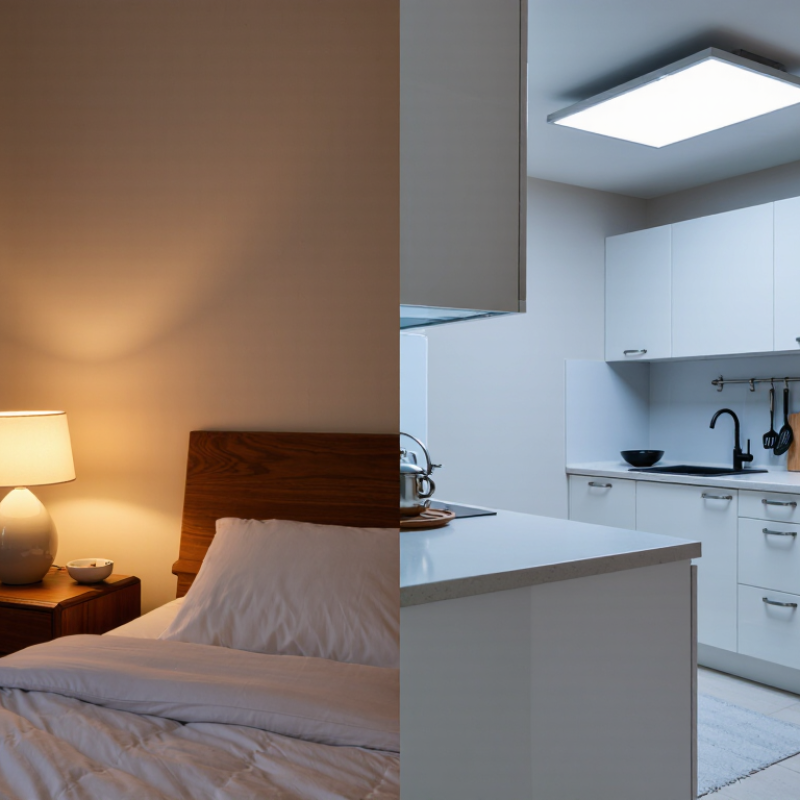
What Warm White and Cool White Mean
Warm white describes light with a yellow or amber tint, similar to an incandescent bulb or late-afternoon sunlight. It often falls around 2,700–3,000 kelvin, though product ranges can vary. Cool white looks less yellow and more neutral or slightly blue. It commonly sits around 4,000–5,000 kelvin. These numbers describe the light’s color appearance, not how hot a bulb gets or how bright it shines. Small detail, big difference.
In a living room, warm white can make wood grain and skin tones feel softer, especially after dark. Cool white may make a kitchen counter or work area look clearer and crisper. But the room matters: pale walls, daylight, and even a lampshade can shift what the eye sees. I have found that “cool” sometimes feels stark in a small room, yet that is not universal. Brightness is measured separately, so a cool-white lamp is not automatically brighter. Check the kelvin rating, then test one light in the actual space if possible. The label helps, but your eyes have the final say.
How Color Temperature Changes the Appearance of White Light
Warm and cool white differ mainly in color temperature, not in how much light a bulb produces.
ENERGY STAR’s lighting guidance places warm white around 2700–3000 kelvins and cool white around 3500–4100 kelvins. Higher values look less yellow and more blue-white. The CIE International Lighting Vocabulary (S 017/E:2020) defines correlated color temperature as a way to describe a light source’s color appearance. It does not measure brightness or color accuracy. That distinction matters.
Picture a cream-colored wall under a 2700K lamp: it can look golden and soft. Under a 4000K lamp, the same wall may seem cleaner, even slightly gray. In a kitchen, cooler light can make steel and white tile look crisp; beside wood furniture, it may feel stark. Small shift. A practical test is to compare bulbs in the actual room, with the same lampshade and time of day. I would not choose by packaging alone; surrounding daylight changes the effect. Also check the color rendering index (CRI): CCT describes the white hue, while CRI indicates how faithfully colors appear. A high CCT does not automatically make food, fabric, or skin look more natural.
Key Differences in Mood, Brightness, and Visual Effect
Warm white and cool white differ most in mood and visual character. The CIE’s International Lighting Vocabulary classifies warm-white light below 3,300 K, intermediate light from 3,300 to 5,300 K, and cool-white light above 5,300 K. In homes, warm bulbs around 2,700–3,000 K often make wood, skin, and soft fabrics look golden. They suit quiet evenings, though food or paint colors can appear less accurate.
Cooler light, commonly around 4,000–5,000 K, looks whiter or slightly blue and can make edges and printed text feel more distinct. It often suits kitchens, workshops, and task areas. But “brighter” is not the same as “cooler.” The U.S. Department of Energy’s lighting guidance uses lumens to describe light output; kelvins describe color appearance. An 800-lumen warm bulb and an 800-lumen cool bulb have the same rated output, although their contrast can feel different in a room.
Color matters. A practical test is to place both temperatures beside the same countertop or reading page at night. Notice the shadows, glare, and how colors shift. Room finishes, dimmers, and personal preference can change the result, so a standard chart cannot predict every space. I still find cool light harsh in some rooms, even when its details seem clearer. That judgment is subjective, and it deserves a real-world check.
Warm White vs. Cool White: Color Temperature
This chart compares representative color temperatures: warm white at 2700 K and cool white at 5000 K. Warm white typically appears more yellowish and is often perceived as cozy; cool white appears bluer and is often perceived as crisp or energizing. These impressions vary by person and setting.
Color temperature does not determine brightness. Brightness depends mainly on light output (lumens) and the fixture; visual appearance is also affected by surrounding colors and room conditions.
Where Warm White and Cool White Work Best
Warm white, usually around 2,700–3,000 kelvins, suits rooms meant for unwinding. It gives living rooms and bedrooms a softer feel, especially after sunset. Picture a reading lamp beside a fabric armchair: warm light makes the corner feel inviting without turning the whole room bright. It also works well over dining tables, where a little amber tone can make wood and food look richer. Test it at night. Wall colors and lampshades can shift the effect more than expected.
Cool white, often around 4,000–5,000 kelvins, is useful where clear visibility matters. Kitchens, laundry rooms, garages, and home work areas can benefit from its cleaner, more neutral appearance. It helps reveal details on a cutting board or inside a drawer, though very cool light may feel stark in a small room with pale walls. Small detail, big shift. A practical approach is to match the light to the task, then check it in the room itself; printed color temperatures do not tell the whole story. If a space serves both work and relaxation, separate lamps or dimmable lighting can offer more flexibility, though the controls may take some getting used to.
What Is the Difference Between Warm White and Cool White? — Where Warm White and Cool White Work Best
| Comparison |
Warm White |
Cool White |
| Typical color temperature |
Usually about 2,700–3,000 K. The light appears yellowish or softly golden. |
Usually about 4,000–6,500 K. The light appears whiter, and at the upper end may look bluish. |
| Visual atmosphere |
Creates a relaxed, cozy feel and can make a room seem softer and more intimate. |
Creates a crisp, energetic feel and can make details appear more distinct. |
| Where it works best |
Bedrooms, living rooms, dining areas, and other spaces used for relaxing or entertaining. |
Garages, utility rooms, workshops, and task-focused areas where clear visibility is useful. |
| Common uses |
Ambient lighting, bedside lamps, decorative fixtures, and evening lighting. |
Task lighting, workbenches, some office settings, and spaces where a brighter-looking light is preferred. |
| Effect on colors and materials |
Can bring out warm tones such as reds, oranges, and wood finishes; whites may look creamier. |
Can make whites look cleaner and cooler; warm finishes may appear less golden. |
| Choosing between them |
Choose it when comfort and a warm, welcoming appearance are priorities. |
Choose it when a cooler appearance and a more alert, task-oriented atmosphere are priorities. |
| Practical note |
Color temperature describes the appearance of the light, not its brightness. Compare lumens for brightness, and check the fixture or bulb specifications because color-temperature ranges can vary by product. |
How to Choose the Right White Light for Your Space
Choosing the right white light starts with the room’s purpose, not a rule that one color is universally better.
The U.S. Department of Energy’s lighting guidance describes color temperature in kelvins: lower values look warmer, while higher values appear cooler.
Warm white, commonly around 2700–3000 K, suits bedrooms and living rooms, where amber-toned light can make wood and fabrics feel inviting. Cool white, often around 3500–4100 K, can help kitchens, laundry areas, and workspaces feel clearer. These ranges are useful, not absolute; bulb labels can vary.
Look at what you do in the space. For reading beside a sofa, try a warm lamp with a focused shade. At a kitchen counter, cooler light may make chopping and cleaning easier to see. Test it after sunset.
DOE guidance also distinguishes color from brightness: lumens indicate how much light a lamp produces, while kelvins describe its appearance. A high-kelvin bulb is not automatically brighter. Check the finish of nearby surfaces, too; cool light can make gray tile feel stark, while warm light may shift white paint toward cream.
The awkward part is that one room may need both. A ceiling fixture and a task lamp can serve different jobs, though matching their color temperatures takes a little trial and error.
Conclusion
What is the difference between warm white and cool white? The main distinction is color temperature, which affects how white light looks and feels. Warm white has a softer, slightly yellow or golden tone, creating a cozy and relaxed atmosphere. Cool white appears more neutral or bluish, giving spaces a crisp, bright, and energetic feel. These differences can also influence how colors and details look, as well as how bright a room seems.
Warm white often suits bedrooms, living rooms, and other areas where comfort and calm are priorities. Cool white can work well in kitchens, bathrooms, work areas, or places where clear visibility is useful. To choose the right option, consider the room’s purpose, the mood you want to create, the amount of natural light, and how the lighting complements nearby colors and materials. The best choice is the one that makes your space feel comfortable and works well for the activities that happen there.

 Glow Light